It’s all starting to get a bit real.
My debut poetry collection is to be published by Bradshaw Books this year, and I received news last week confirming they’re aiming for a May launch in Dublin, which is much earlier than I’d expected. Time to dig out the big girl pants.
The manuscript is being reviewed at the moment and the publisher is hooking me up with an editor, to help tidy things up and, hopefully, impart a firmer grasp on the rules of grammar than I have hitherto managed to retain. One can but hope.
Then there’s the cover. I’ve been thinking a lot about this – I am primarily a visual thinker and the conundrum of how to visually present the written work has been a pleasant enough little problem to toss around the grey cells of an afternoon. I’ve been asking myself, “What makes for a good book cover design?”
Design is a word we’ve becomes desensitised to, due to its over-use in popular culture, where attaching a brand label makes an item ‘designer’ – a name as representation of skill rather than an object as evidence. My coda is ‘Good Design Works’, by which I mean that design is not simply the act of making a product look pretty, or expensive by association, it is the natural outcome of solving a series of problems. I know this process well from my architectural training and practice; book art is a different field of design but the principles are the same and I’m curious to see them at work.
I searched for examples of book art – to see what kind of visual ideas I’m attracted to in this medium, but also to understand what makes for a great book cover – and identified 3 main approaches: typography (using letters, symbols and typefaces only), photography and illustration, the latter covering everything from line drawing to painting to collage to graphic design.
But I also discovered really great book art reflects something of the nature of the book itself: its themes, its ideas, its scope. A book’s cover is a visual tease, inviting the reader to stay and explore the promise of the initial flirtation.
Here are some of my favourites:
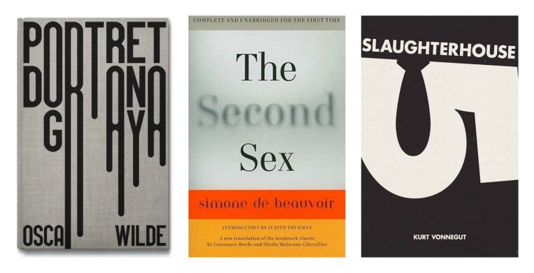
Typography
All of these covers do more than just provide a title and author, they capture the essence of the book – look at the lettering on Wilde’s Dorian Gray, like drips of paint or words slowing melting toward disintegration; or the blurring and dimming of the word ‘Second’, perfectly illustrating de Beauvoir’s concerns about the unequal treatment of women throughout history (whilst the words in bold suggest a more apt alternative); or the subtly clever positioning of the number ‘5’ to form the silhouette of a bomb in Vonnegut’s novel, where the fire-bombing of Dresden is a centrepiece.
Illustration
3 very different examples of illustrated book art – I love how the Burgess cover reduces the figure to its iconic essentials, becoming a symbol rather than a person, dehumanised, reflecting the novel’s culture of orgiastic violence; Forster’s Howards End is represented by the humble umbrella, an innocuous yet pivotal player in the novel’s plot – it is Helen Schlegel’s inadvertent pilfering of an umbrella that introduces her to Leonard Bast, the lowly bank clerk with intellectual aspirations, with disastrous consequences; and is there really anything left to be said about the wonderful illustrations, created by J.R.R. Tolkein himself, to map his imagined world of Middle Earth?
(Other than, perhaps, to enquire if I’m the only person who sings ‘Hotel California’, when Pippin cries, “The eagles are coming!” in the film version of ‘The Return of the King’? Hello? Anyone? OK, moving on…)
Photography
I know nothing of the nature or content of ‘Music of the People’, but this cover is such a delight – the railings of the seafront location forming the stave, with people and street furniture as musical notations – it makes me want to sing! (Book Art – The Musical! Coming soon!) The ‘Pinocchio’ cover is much more poignant: the figure, carved by Geppetto and called his son, is so pathetically home-made, only a most desperate need or love could transform him into a ‘real boy’. Finally, a cover for Stig Larsson’s ‘The Girl with the Dragon Tattoo’, here with the direct translation of its Swedish title and a much rawer cover than the blockbuster airport versions – both the title and the aggressive tear act as counterpoint to the soft tones and tenderness of the image, underlining the novel’s brutal exploration of misogyny.
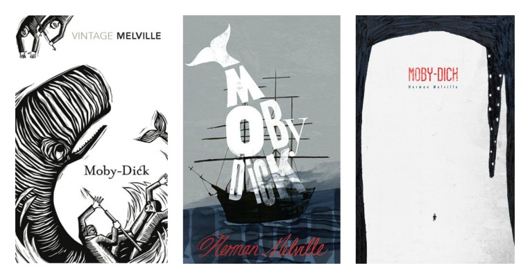
It’s also interesting to look at the various treatments of a classic novel, like ‘Moby Dick’…
Well, its about a whale, a white whale, so thank you No. 1, points for technique but must try harder; No. 2, whale, check, white, check, ship, check; but it’s No. 3 that really does it for me because, of course, Moby Dick isn’t about a white whale, it’s about a man’s destructive obsession with a white whale and here it is, illustrated – the tiny figure of the man and the epic proportions of the whale, distorted beyond all reality by Ahab’s monomaniacal desire for revenge.
For my own cover, I want the visuals to reflect a journey through dark times, lives lived and endured, the possibility of hope and redemption. A tall order but this exercise has certainly shown me the potential for cover art to add another dimension to the words within.
For more information on the above cover designs, including design attributions, take a look at the Book Cover Art & Illustration board on A Dreaming Skin’s Pinterest page, where you’ll find lots of other great book art and illustrations that caught my eye.


One could only wish for such a great beginning. Congrats and good luck in your endevours.
Dee
Thank you for the kind words of encouragement, Dee!